
What is the difference between RGB and CMYK?
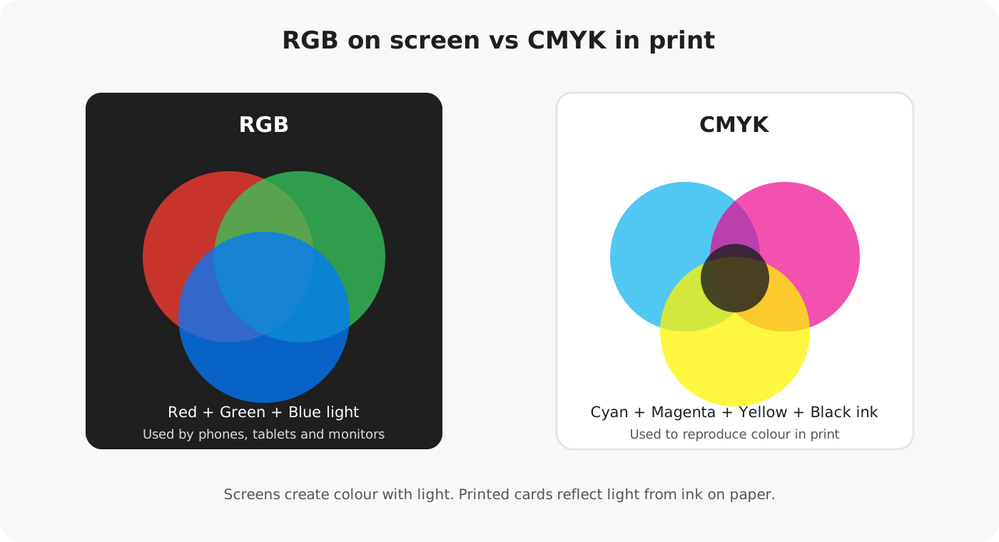
RGB and CMYK are two different ways of creating colour. RGB stands for Red, Green and Blue and is used by screens. CMYK stands for Cyan, Magenta, Yellow and Key (Black) and is used to reproduce colour with ink in print.
A screen creates colour by emitting light. A printed card cannot emit light, so its colours are created by ink on paper reflecting the light around it. That fundamental difference is why a printed colour will not always look exactly the same as the colour you see on a phone, tablet or monitor.
Why can my printed colours look different?
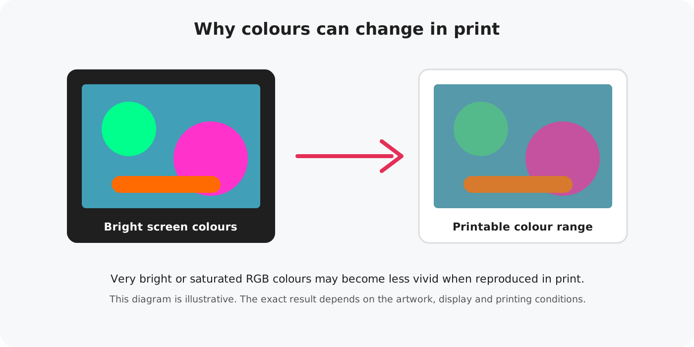
RGB screens can display some very bright and highly saturated colours that cannot be reproduced in exactly the same way using printing inks. When artwork is prepared for print, colours outside the printable range have to be translated to colours the printing process can reproduce.
This is particularly noticeable with some very bright blues, greens, oranges, pinks and other highly saturated colours. They may appear slightly less vivid when printed than they do on a bright screen.
Screen brightness, display settings, calibration and even the device you are using can change how artwork appears. The same design can look slightly different on two different screens before it is ever printed.
How should I prepare colours for Connect?
When creating artwork for print, it is useful to design with CMYK reproduction in mind. If your design software supports print colour previews or soft proofing, these tools can help you spot particularly bright colours that may change when printed.
For Connect, your finished artwork should be exported as a high-quality RGB/sRGB JPG or PNG at 300 DPI. This gives Connect a consistent image file to process through our print workflow.
Be aware of the printable CMYK colour range and avoid relying on extremely bright screen-only colours.
Export your finished Connect artwork as a high-quality RGB/sRGB JPG or PNG at 300 DPI.
Different printing systems, inks and papers can use different colour profiles. Our workflow handles the print conversion, so supplying the finished image in RGB/sRGB avoids an unnecessary extra conversion before production.
Will my printed card exactly match my screen?
No printing process can guarantee an exact visual match to every screen. Screens emit light and can vary considerably in brightness and colour, while a printed card reflects the light around it.
Paper also affects how colour appears. A printed card should therefore be judged as a physical printed product rather than against a brightly lit screen.
Brightness, calibration and display technology all affect what you see.
Ink, paper and surrounding light affect the appearance of the finished colour.
Order a sample when colour is important
If a particular colour is important to your design or brand, we recommend ordering a physical sample before offering the design for sale. A printed sample is the best way to judge how your artwork will reproduce on the finished card stock.
This is particularly useful for designs with very bright colours, dark backgrounds, subtle tones or colour-critical branding.
Quick colour checklist
The simple rule to remember
Your screen shows colour with light. Your card shows colour with ink on paper.
A small difference between the two is normal. Preparing artwork with print in mind and checking a physical sample will give you the clearest idea of the finished result.
Read the Upload Artwork Guide